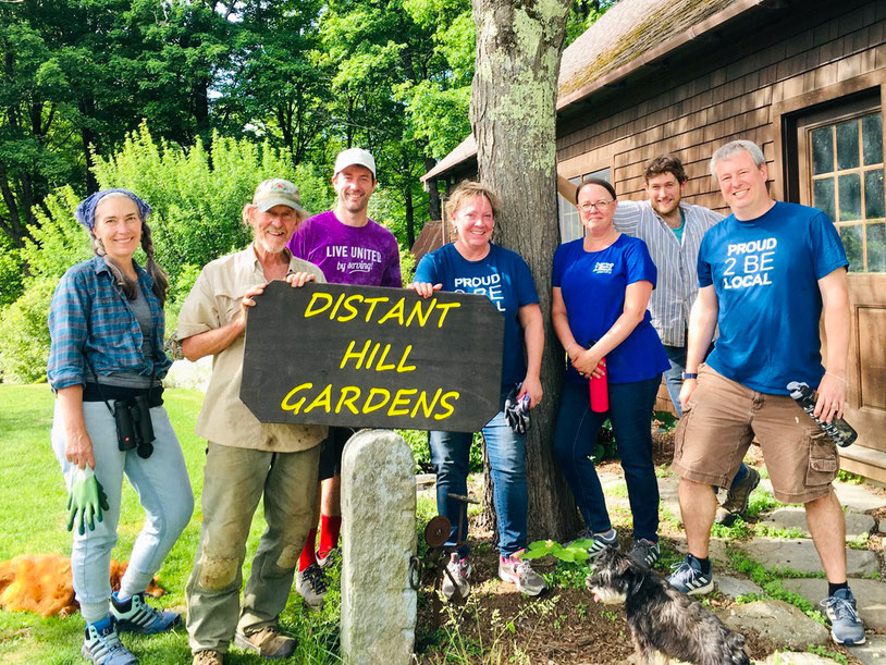
As part of Design Center at KSC, the class of designers collaborated with the local non-profit Distant Hill to develop a new logo system representing all facets of the business as it expands. The logo needed to be highly legible for their older audience, flexible enough to work in vertical/horizontal lockups, and easily tailored on clothes. After visiting the location and discussing goals with the client, we were given 3 revisions (sketch to final) before the next meeting.
My designs focused on the organic beauty of nature, winding paths, and the plants/animals important to the business.
Initial Sketches
3 New Directions
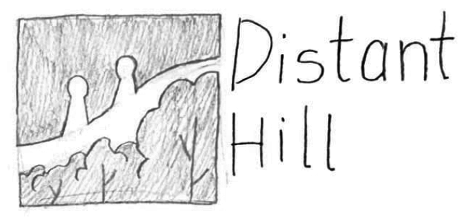
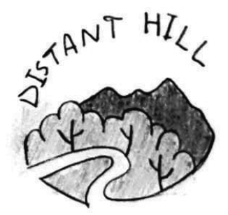
The first logo presents an imperfectly drawn scene, with mountains, shrubbery, and a winding road to represent both trails and streams. A bold sans serif matches the logo in weight, while the secondary type matches the thinner weight of the tree's outline. This version is easily sewn on clothes and converted to different lockups and submarks.
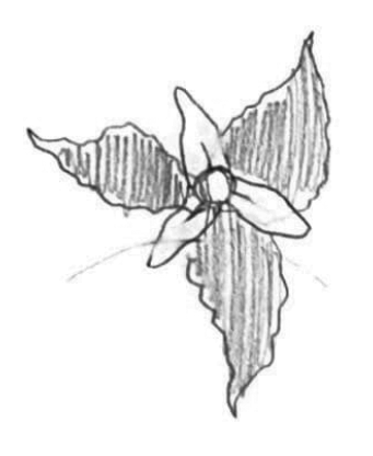
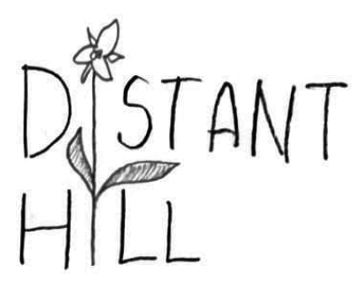
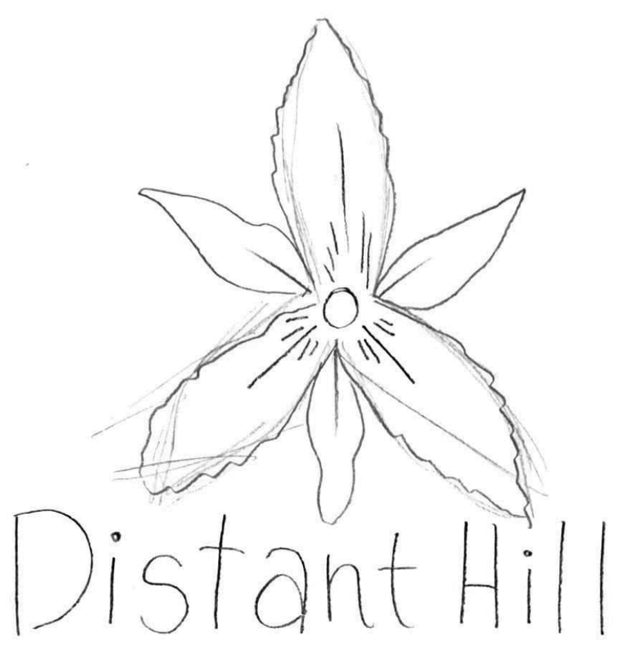
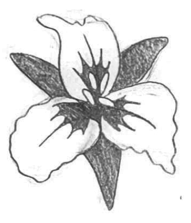
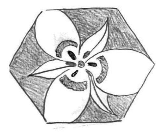
The middle logo centers around an illustrated painted trillium, which appears along the nature trails. Because of the delicate lines with varying thickness, the font shares some flair in the "t"s and "a". Similar to the first logo, the weights of the type match the stroke weights in the image.
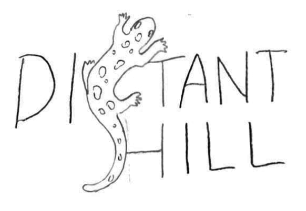
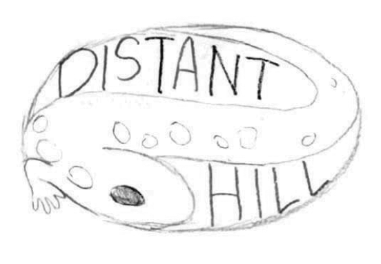
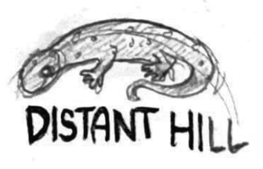
The last logo is a more experimental direction, with a spotted salamander wrapped around the side of the text. This logo is less easily reformatted, yet leaves the opportunity for the salamander to stand alone as a submark. Leaving out "Gardens & Trails" allows the business to grow and change without another rebrand.
Original Brand Identity
